ZHUMA
“Blended, not Mixed… Fusion, not Contemporary… A Neo-Modern Design with An Exquisite Touch, nonetheless so Authentically Japan”
YEAR
2004
CLIENT
Zhuma Mitra Jaya
SERVICE TYPE
Brand Design + EGD
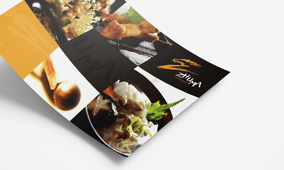
Zhuma is elegant, genuine and unwavering in its core message of delivering Japanese-authentic taste comprised and balanced with local preference. A statement of high-style and fusion, the bistrro manifests decades of loyal fans as it expand as a popular brand.
Accommodating the elegant interior design, fresh sushi/ sashimi alongside its first-rate hospitality, the identity idea was inspired by kanji-character. Hand-crafted letter of the logotype, combined with a mark of a horse-head shape (horse: ’MA’ in japanese), a graceful animal to portray beauty and hard works and also symbolizes the brand's initial.
The identity was included in an International publication. (Rockport’s LogoLounge series 5, in 2009)


view other works


For inspiration
kookking.design
© 2024 KOOKKING Design. All rights reserved.